An address plaque is one of those exterior elements that homeowners often treat as a default purchase rather than a design decision. Pick something legible, screw it to the wall, move on. On a modern home, that approach almost always produces a result that looks slightly off — a generic plaque hanging awkwardly on a carefully composed facade. Contemporary architecture is unforgiving of small inconsistencies, and the address plaque is one of the more visible places those inconsistencies show up. Choosing well is straightforward once you understand what makes a plaque feel architecturally appropriate rather than just functional.
Why a Plaque Instead of Individual Numerals?
Both options work on modern homes, and the choice between them is largely a question of context. Individual floating numerals suit clean wall surfaces with enough open space to let each numeral breathe — large stucco planes, fiber cement siding, smooth concrete. Plaques work better in more constrained situations: narrow entry columns, brick or stone walls where individual mounting would be difficult, recessed entry alcoves, and homes where the architect wanted a single contained signage element rather than scattered numerals.
A well-designed plaque also offers practical advantages. The numerals come pre-spaced and aligned, so installation is dramatically simpler than mounting four or five individual numbers with millimeter-level precision. The plaque acts as a self-contained design object, which means the surrounding wall surface does not need to be perfect to support it. And because plaques can incorporate both numerals and lettering — street names, family names, suite numbers — they handle multi-line addressing in a single coordinated piece.
What Address Plaques Work Best on Modern Homes?
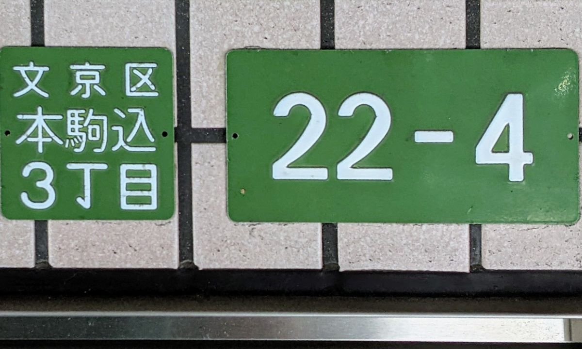
Modern homes rely on clean geometry, restrained detailing, and exterior elements that reinforce architectural consistency. Address plaques sit near the entry sequence and remain visible from the street, so oversized decorative borders, script lettering, or reflective plastic surfaces often conflict with contemporary facades. The strongest modern signage uses simple typography, durable materials, and layouts that support both readability and minimalist design language.
Homeowners updating exterior signage often choose modern address plaques because contemporary plaque designs combine architectural styling with practical street visibility. Metal and acrylic construction resist weather exposure, while engraved or raised lettering creates stronger contrast against stucco, brick, wood siding, and painted masonry. Larger numerals improve wayfinding for guests, delivery drivers, and emergency services without overwhelming the facade. Floating mounts and concealed hardware also create subtle shadow lines that add dimension without introducing decorative clutter.
Typography affects curb perception as much as material selection. Thin decorative fonts disappear against textured exterior surfaces, but geometric sans-serif lettering maintains clarity from longer viewing distances. Plaque orientation matters as well. Horizontal layouts complement wide contemporary elevations, while vertical address plaques fit narrow entry columns and modern farmhouse facades. Consistent finishes across lighting fixtures, door hardware, mailbox details, and address signage create a unified exterior composition that feels intentionally designed rather than assembled from unrelated accessories.
Material Selection
The material a plaque is made from determines both its visual character and its durability over time. On a modern facade, the realistic options narrow to a small set.
Solid Metal
Aluminum, stainless steel, and bronze plaques produce the most architecturally serious result. Cast or machined metal holds its edges across years of weather exposure, and the finish ages gracefully — patinas on bronze, slight matte softening on aluminum, near-permanent stability on stainless. Metal plaques carry visual weight that reads as deliberate. They are also the most expensive option, but for a piece that defines the entry sequence, the cost is usually justified.
Acrylic and Composite
High-quality acrylic plaques offer a lighter visual presence and lower price point. They suit smaller homes, secondary entries, and situations where a metal plaque would feel too heavy for the surrounding architecture. The risk with acrylic is quality variation — cheap acrylic yellows under UV exposure within a few years, while properly UV-stabilized material holds its appearance much longer. If you go acrylic, buy from a brand that publishes its UV resistance data.
What to Avoid
Cast resin plaques painted to look like metal almost always read as imitation up close. Wood plaques, even sealed ones, weather inconsistently and tend toward a more traditional aesthetic. Reflective plastic plaques designed to flash under headlights look practical but undermine modern restraint. None of these belong on a contemporary facade.
Typography on a Plaque
The same typographic discipline that applies to individual house numerals applies — perhaps even more strictly — to plaques. Because the numerals and lettering on a plaque sit within a defined frame, any awkwardness in the type design is amplified. Geometric sans-serif typefaces, drawn from the same family as Futura or Avenir, work well on minimalist modern homes. Humanist sans-serifs suit warmer modern styles that mix wood, metal, and natural materials. Decorative scripts, ornate serifs, and condensed display fonts all belong to a different design vocabulary and should be avoided.
Spacing within the plaque matters too. Numerals and letters that are jammed close together lose definition at distance. A plaque with generous tracking — the space between characters — reads more cleanly from the curb and signals quality of design.
Layout and Orientation
Plaque orientation should follow the architecture. A wide modern home with horizontal siding usually accepts a horizontal plaque most naturally, because the plaque’s shape echoes the dominant lines of the facade. A modern farmhouse with a tall narrow entry column, or a townhouse with a vertical pilaster, often suits a vertical plaque better. The principle is simple: the plaque should extend rather than fight the geometry around it.
Multi-line plaques — those that include both house number and street name, or number and family name — work well in entries where the plaque is the dominant signage element. Single-line, number-only plaques work better when the address is also reinforced by a mailbox or curbside marker.
Coordinating With Other Exterior Elements
A plaque does not exist in isolation. Its finish should sit in the same family as the door hardware, sconces, mailbox details, and any visible gate or rail hardware. If the rest of the entry hardware runs matte black, the plaque should belong to that family. If brushed stainless threads through the door pulls and lighting, repeating that finish on the plaque extends the design language coherently. Introducing a new finish at the plaque, even a high-quality one, tends to read as inconsistent rather than as an accent.
This level of coordination becomes particularly important when the home is being prepared for resale. Exterior consistency signals care to potential buyers, and an updated address plaque is one of the more cost-effective improvements in the entryway. For homeowners thinking about that broader picture, this guide on how to prepare your home for a quick sale walks through the smaller exterior touches that make a measurable difference in showings and listing photography.
Drawing on Modern Design Precedents
Modern address signage borrows heavily from the typographic and material vocabulary of mid-century residential design — clean type, durable metals, restrained detail. Looking at how mid-century architects approached exterior signage and mailboxes is a useful exercise before finalizing a plaque selection. Dwell published an instructive collection of mid-century modern mailbox and address ideas that captures the design discipline contemporary plaque design still draws from.
Mounting and Installation
Float-mounted plaques, where the entire plaque sits a half-inch off the wall on hidden standoffs, produce the shadow line that defines high-end contemporary installations. Flush-mounted plaques work too and require less precise installation, but they lack the dimensional quality of a floating mount. Choose float-mount where the surface and substrate allow it, and flush-mount where wall depth or material limitations make standoffs impractical.
Whichever method you choose, take time with placement. Mark the position with painter’s tape, view from the curb, and adjust before drilling. A plaque mounted slightly off-center on the wall plane it occupies will register as wrong in every photograph of the home from that point forward.
A Note on Modern House Numbers
Modern House Numbers has built its reputation on architecturally minded address hardware, and the plaque category is one of the areas where that focus shows most clearly. The brand’s plaques are produced from durable metal substrates with engraved or raised lettering, designed in clean contemporary typography, and offered in finishes that map onto the most common modern entry palettes — matte black, brushed stainless, satin brass, bronze, and aluminum. Sizing and orientation options accommodate horizontal and vertical entry conditions, and float-mount hardware produces the shadow line associated with high-end exteriors. For homeowners specifying a plaque as part of a coordinated modern facade, the catalog offers a level of finish quality that holds up against the rest of a thoughtfully designed entry.
Final Thoughts
Choosing an address plaque for a modern home is fundamentally an exercise in restraint. Pick a durable material that will hold its appearance through years of weather. Commit to a finish family that already lives elsewhere on the entry. Choose typography that reads cleanly at distance — geometric or humanist sans-serif, properly tracked, sized for the actual viewing condition. Match the plaque orientation to the architecture around it. Mount it precisely and let the shadow line do its quiet work. None of these decisions is dramatic on its own, but together they produce a small piece of exterior hardware that quietly reinforces everything else the architecture is trying to say. That is what modern design has always been about: the careful accumulation of small decisions made well.